Photographic Postmortem
postmortem |pōstˈmôrtəm|noun(also postmortem examination )an examination of a dead body to determine the cause ofdeath.•
an analysis or discussion of an event held soon after ithas occurred, esp. in order to determine why it was afailure: an election postmortem on why the party lost.
Though the term postmortem is usually thought of in forensic terms, for years I’ve used it for other purposes. After every workshop during the GAPW years we held a Postmortem after each event to evaluate what went wrong, what went right, and how to learn from the experience.
I would like to start a series of posts that are postmortems of images. Let me share what I think went wrong, what went right, and what we can learn from the image and the exercise of taking it.
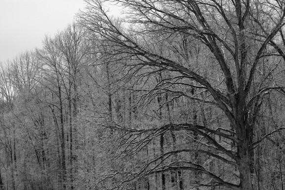
The image above, we will call “trees in snow”.
How it happened: I was driving to dental appointment and was early, I always try to be early because the best shots appear when you are running late!!! I saw the single large tree near the edge of the road and the other trees in the distance behind it. With the light snow on the branches and the overcast light it just looked interesting to me. By the time I knew I wanted to photograph it I was past it. I went down the road and found a safe place to turn around and then went back past the shot and started back down my original path. Since traffic was light I was able to drive slowly watching for the shot to appear out my drivers window and then drive slowly until I saw the “perspective” that I thought worked best. I pulled off the road there and put on my hazard blinkers. There was no safe place to get out and set up a tripod. I knew it was going to have to be a handheld shot.
Setting up the shot: My driver’s side rear view mirror was in the way so I pulled forward a few feet so I had a clear shot past the mirror. I knew that I would need a longer lens so I put my 55-200 on my Fuji X-E2 camera body, I zoomed until I got the framing I wanted. Since I was sitting in the car it was necessary to hand hold the shot. I set my ISO at 1600 so I could have a fast enough shutter speed that along with the OIS (Optical Image Stabilization) in the lens I could get a tack sharp image. 1/1600 sec; f/9; ISO 1600
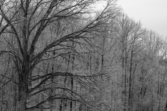
Composition: I positioned the camera so that the tree occupied the right hand side of the frame with the branches reaching back into the frame. I was glad the sky was pretty dark and wasn’t drawing the eye away from the branches. I thought at the time I wish the tree was on the left side of the frame reaching right, so I flipped the image in Photoshop below to see how it felt. I think it works either way.
Final Analysis: It was worth stopping, I like the monochrome simplicity but also the complexity of the branches and opposing tones. I’m happy with the shot, but not overwhelmed by it. If I passed some similar situation I would still stop and give it try!
Now the fun part, chime in with your thoughts!! We can all learn from each other here!
Blessings,
the pilgrim
This entry was posted on Wednesday, January 22nd, 2014 at 4:12 pm
You can follow any responses to this entry through the RSS 2.0 feed.


The most impressive thing you did was to stop and turn around. I can’t count how many times I saw something I wanted to shoot as I was driving by, and kept driving kicking myself for doing so but still not turning around. There’s a lesson there.
I hope so !
Best line in the post – “I always try to be early because the best shots appear when you are running late”
Personally I like the tree on the right side. The limbs lead you across the image and the large trunk acts as a wall to stop your eyes. That also gets my eye away from the triangle of sky instead of leading me to it.
Like the concept of this post.
Thanks, plan more!!!
Like Casey, I like the tree on the right side. I was trying to figure out why when I read Casey’s comment. I think he is exactly right, errr, correct. The leading line quickly leads the eyes from left to right (the way we read – at least here in the US), stops at the tree and then draws the eyes back more slowly to take in everything. I like it. Fun post. Great exercise. Thanks, Bill
Glad you enjoyed it!
Analyzing the image and how it was made leads one to question much more than just the how the image looks. It forces us, the viewers and commenters, to analyze much of what we would do when presented with something similar.
First, you seized the moment and took the photo. Safely. You quickly made good choices to prevent the moment from escaping. You recognized that a monochrome presentation would keep the viewer focused on the shapes and not get lost in multiple colors. Once you had the image you kept looking for improvements and weren’t settling for what you had (what the camera saw). These are all pluses. The minus is that the image’s story isn’t readily apparent to me. The image is nice but as you indicated, not overwhelming. Sometime nice is good enough.
I prefer the image with the tree to the left and sky to the right. Why? I’m don’t know. I’ll have to ponder that question a while. Maybe my preference is influenced by the lighting at my computer. Maybe it is the western civilization tendency to start on the left and move to the right as I go from the trunk and bark detail to the limbs and branches and the tips of the twigs. Perhaps with the tree on the right I sense that the tree is holding me there — imprisoning me within the confines of the frame. (A couple of commenters liked the containment provided by the tree on the right.) Maybe it’s something altogether different. The monochrome treatment does give a ‘cold’ feel to the image which is appropriate for winter and the current cold spell.
Thank for exercise and proposing to have a series of images to consider. I’m certain that reading the comments of others will help me become a better photographer.
I completely agree with your thoughtful assessment, and also agree that the image is far short of stellar. That was part of the object lesson as well, and you got it, congratulations! There is detail and some level of graphic design, but it lacks a story or message. In future Postmortem exercises, I hope to illustrate that point. Thanks for taking the time to fully explore the lesson!
I have a suggestion for you and others as well. If you shoot out of a window take a piece of a swimming “noodle” and cut it off about 8 inches long. Then slice it longways to the center so that it will slide over your glass. Now you have a good cheap camera rest. Or you could buy a puffin pad for about $35. You will be surprised how much stability it will give you.
Great suggestion, and I do have a Puffin Pad and love it! The swimming noodle is also a clever idea!
I like the big tree to be on the right more than the left. It isn’t a wow jaw dropping picture, but not every picture has to be. Perhaps the joy of an image can be in the adventure leading up to it or the memory it might create when seeing it in the future.
And there is something about old trees that makes me stop every time even when I know I’m not going to probably get an optimal super shot.